
What is a UI/UX Designer? Theory, The Fried Rice Analogy, & The Solo Developer Reality
Table of Contents ▼
- ■ Analogizing UI and UX: Fried Rice and Sport Bikes
- ■ The Danger of “Straight to Code” and the Flowing Design Evolution
- └ 1. Start with Paper (Paper Prototype)
- └ 2. Building the Digital Bones (Low Fidelity / Wireframe)
- └ 3. Breathing Life (High Fidelity / Mockup)
- ■ The Solo Developer Case Study: Formulating UX Through Competitor Analysis
- ■ Conclusion: Hard Work Betrays None
In the world of digital product development, the profession of a UI/UX Designer is often misunderstood simply as an “illustrator” or a creator of pretty interfaces. In reality, behind a simple button lies a deep process of psychology and analysis aimed at solving user problems.
In corporate industries, the UI/UX pipeline is highly ideal and complex. It involves market research, questionnaires, crafting user personas, and conducting usability testing over and over again. I personally experienced the rigor of this process while participating in the Studi Independen Bersertifikat (SIB) x Dicoding program in 2022. During the 6-month program (graduating in December 2022), the specific UI/UX module took up 1.5 months itself. Of course, as an independent developer, we could easily “trim” the time to just two weeks, but that is the rigid standard in the industry.
But how does it work in practice if you are a Solo Developer? In this article, we will dissect the basic theory of UI/UX in human terms, break the bad habit of “jumping straight into code,” and reveal the design kitchen of the Asmaul Husna app—a personal project successfully downloaded tens of thousands of times.
Analogizing UI and UX: Fried Rice and Sport Bikes
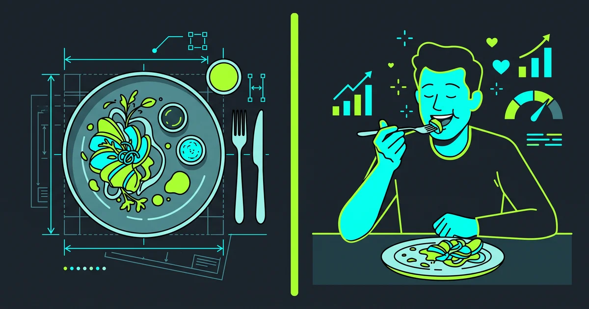
Let’s first clarify the fundamental difference between UI and UX using everyday analogies, so you don’t get dizzy with technical jargon.
UI (User Interface) is the “Plating” or the Outer Appearance. Imagine a plate of Special Fried Rice at a restaurant. UI is how that fried rice is presented. The shape of the rice mold, the perfectly circular arrangement of tomato slices, the symmetrically sprinkled fried shallots, down to the color of the plate. UI pampers your visual senses and ensures the dish looks so tempting that you want to eat it.
UX (User Experience) is the “Taste” and the “Eating Experience”. Then you scoop up that fried rice. UX is about its aroma, the perfect texture of the rice (not too mushy), the well-absorbed flavors, and whether the spoon handle is comfortable to grip. If the plate is aesthetic (good UI) but the rice is too salty and the spoon has a sharp edge that cuts your lip, then the UX has completely failed. You will definitely never return to that restaurant.
Another analogy: Imagine a sport bike with super cool aerodynamic fairings and a fierce matte color (amazing UI). But when you ride it, the seat is as hard as a rock, the handlebar position makes your back ache in 10 minutes, and the engine vibrates violently. That is bad UX.
In short: UX ensures your app solves a problem and is comfortable to use, while UI ensures the app is beautiful to look at. Both must go hand in hand.
The Danger of “Straight to Code” and the Flowing Design Evolution
Many beginner programmers underestimate the design process. “Ah, what’s the point of drawing first, it’s better to just open Android Studio!”
Please, don’t repeat my foolishness. Back then, when I first learned visual programming (in the era of Microsoft Visual Basic and Delphi), I did exactly that. Without thinking twice about layout design, I just drag-and-dropped components and wrote code. The result? My app was a chaotic mess, unresponsive when the screen size changed, and the design hurt the eyes. Ultimately, I threw away all that code and completely rebuilt it from scratch, after forcing myself to make a rough design using… Microsoft PowerPoint!
From that bitter experience, I realized that designing an app blueprint before you start coding (both in terms of algorithms and design) will save us so much time from agonizing code revisions. To avoid ending up using PowerPoint like I did, a proper app design workflow should flow through these three stages:
1. Start with Paper (Paper Prototype)
When a new app idea pops up, keep your hands away from your laptop. Grab a piece of paper and a pen. Why? Because your hands can scribble layout ideas much faster. If the idea doesn’t feel right, you just crumple the paper and throw it in the trash without a second thought. The focus here is purely on brainstorming the menu layout in broad strokes.
2. Building the Digital Bones (Low Fidelity / Wireframe)
Once your scribbles on paper feel solid, move that sketch to a digital canvas (like Figma). At this stage, the design is intentionally left pale (black-and-white or grayscale). Why no color yet? So our brains aren’t distracted by arguing “should this button be blue or red?”. We force ourselves to focus on assembling the foundation: managing spacing, button sizes, and text hierarchy to keep things proportional.
3. Breathing Life (High Fidelity / Mockup)
After the gray bones are sturdy, we breathe life into them. In this final stage, true colors are injected, fonts are adjusted, and real icons are placed. This is the final form that is 100% identical to the actual app and ready to be translated into lines of code.
To prove this evolutionary flow, let’s dissect the design transformation image of the Tasbih Page from my app:
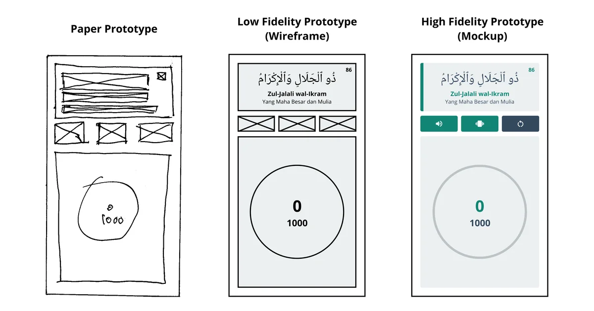
As you can see in the image above:
- In the Paper Prototype stage, I just drew rough boxes and crosses (X) merely to mark where the text and the tasbih tap area (the 0/1000 circle) would go.
- Flowing into the Wireframe, its digital shape begins to emerge. The actual Arabic text (Zul-Jalali wal-Ikram) is inserted to test the screen space proportions, but other elements are still colorless crossed boxes.
- Ending at the Mockup, the visuals come alive. The color green is injected, Material Design icons (sound, vibrate, reset) are placed, and a gray stroke defines the tasbih circle.
The Solo Developer Case Study: Formulating UX Through Competitor Analysis
Theory is beautiful, but reality demands speed. At the end of 2023, three weeks before I started serving as a teacher, I challenged myself to develop a religious app from scratch to release in just two weeks.
As a Solo Developer, I didn’t have time to distribute UX Research questionnaires. Instead, I used the Competitor Analysis technique. I downloaded Asmaul Husna apps scattered across the Play Store and analyzed their main flaws.
I found the users’ biggest pain point: The competitor apps were very heavy, their interfaces were rigid, and most disappointingly, many inappropriate ads kept popping up. This completely ruins the User Experience for a worship app.
From that problem, Asmaul Husna Arti dan Makna (Meaning & Audio) was born. I formulated its UX with a principle: it must be offline-first, extremely lightweight, simple, and clean from inappropriate ads. I wrapped its UI palette in green, representing the nuances of the natural beauty created by Allah SWT.
For the design, I used the digital canvas Figma. I intentionally modified the official visual guidelines from Material Design 3 Android and picked color palettes from the Flat UI Colors website. Because from the start my Figma design mimicked Android’s architecture, during the implementation process into Android Studio (using XML), I rarely had to sacrifice the design because I hit a dead-end with the code.
The only technical compromise that made me sweat was mixing the color variables for the automatic Dark Mode feature, ensuring that the green text remained pleasing to the eye even when the user’s phone screen turned dark.
Conclusion: Hard Work Betrays None
This efficient hard work did not betray the result. The app that I developed alone in 2 weeks managed to win the IDCamp 2023 Challenge (in the Golden Indonesia 2045 Educational Technology Transformation category).
It didn’t stop there; applying the right UI/UX led this app to surpass over 50,000 user downloads, making it the biggest revenue contributor to my AdMob account to this day.
Working in giant corporations does demand long research methodologies. However, if you are a Solo Developer, you are required to be agile, pragmatic, and observant in spotting problem gaps.
Start being sensitive to the problems in existing apps, scribble the solutions on paper (paper prototype), build the skeleton (wireframe), give it a beautiful visual touch (mockup), and immediately open your Code Editor. Happy designing!